
The Snail Design & More identity
The Snail Design & More identity
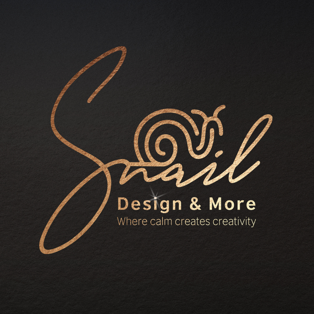
The original logo chosen by Ameer: the Snail name, the snail mark, Design & More and the line Where calm creates creativity.
The Snail identity starts with calm and attention to detail. The mark combines the name with a spiral motif and the line “Where calm creates creativity”. Its visual purpose is a recognisable presence that does not depend on excessive effects. The website pairs ivory and charcoal with bronze accents and generous spacing. Original logo proportions are preserved by adjusting the surrounding image area. The transparent logo and the photographed gold application serve different backgrounds and placements. Clear headings, direct contact controls and layouts for phones, tablets and computers carry the identity into the digital experience. Four language directions share one visual character. This is a study of the studio’s own identity and website application, rather than a client testimonial or a measurement of commercial results.